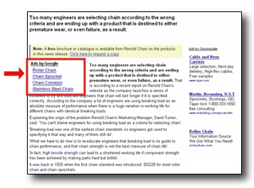
If the voice in your head is still there, it's likely asking, "Where should I place link units on my pages?" Here are some ideas to get the ball rolling:
- Above or below a navigation menu or site search box -- but remember to keep your link units distinct
- Above the fold, at the beginning of pages with more focused content where people may be seeking specific information (article pages, category-level pages)
- In prime spots as designated by our heat map

Link units proved to be the missing link for several of our publishers- you might remember reading about how Engineeringtalk, Ask The Builder, and PCFreunde saw their AdSense earnings soar after adding link units to their pages.
With 12 different sizes, you're bound to find a size that fits snugly into those "hard to reach" areas of your site.
No comments:
Post a Comment